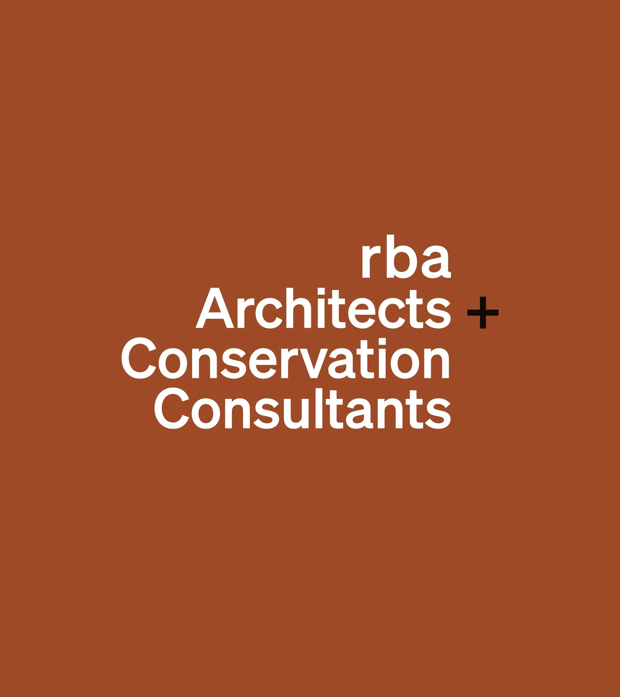
RBA Architects
+ Conservation Consultants
Confident and flexible, celebrating geometry and architectural detailing, this new identity system will continue to grow with the practice.
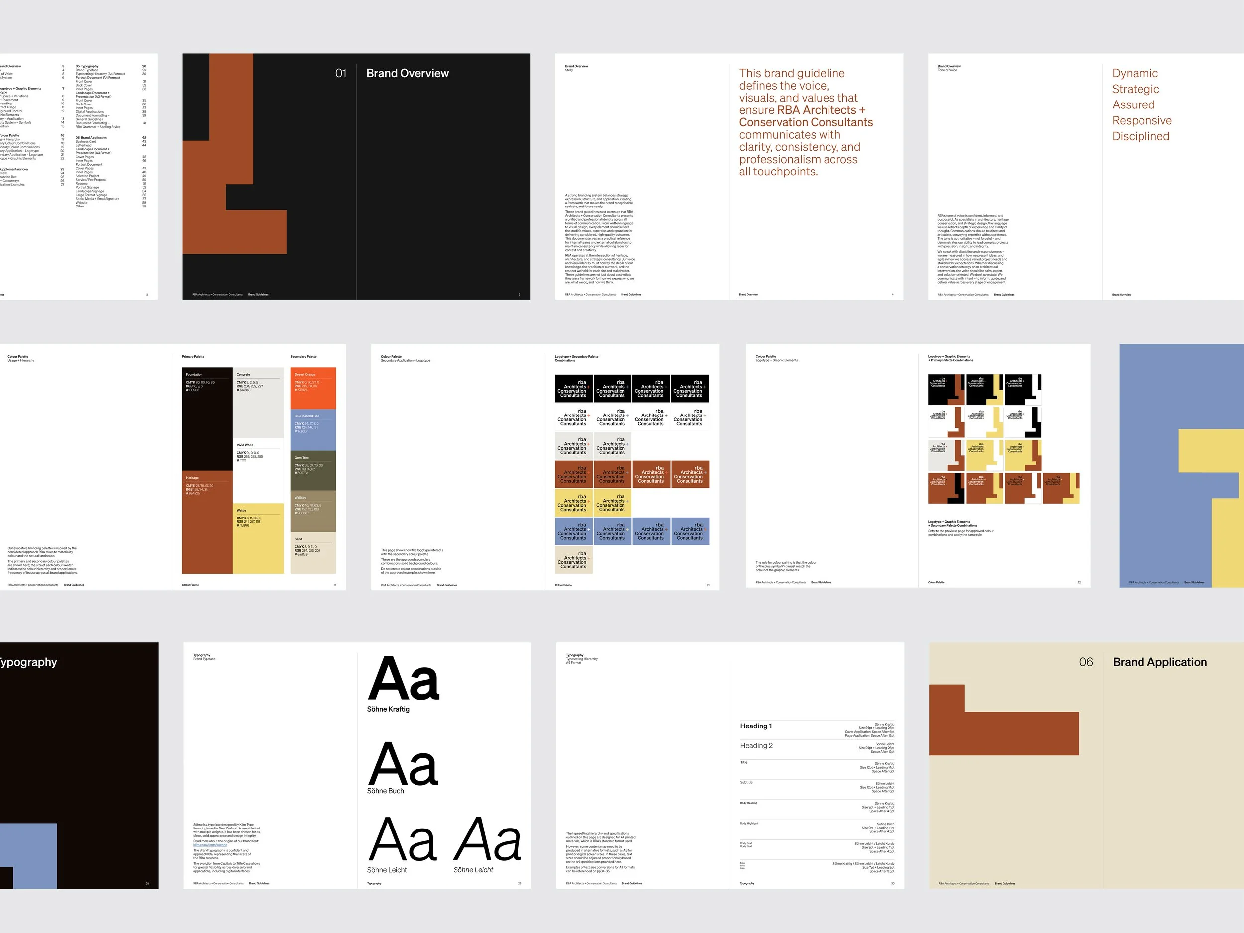
Central to the undertaking of a comprehensive brand review for RBA was to honour their long-established reputation while strengthening their ability to communicate in a rapidly evolving professional landscape.
The original logotype carried strong recognition and trust, particularly within specialist architectural and heritage circles. Rather than replacing this legacy, sensitive refinement saw the preservation of its core structure while improving its versatility, clarity, and performance across broad application, especially digital usage.
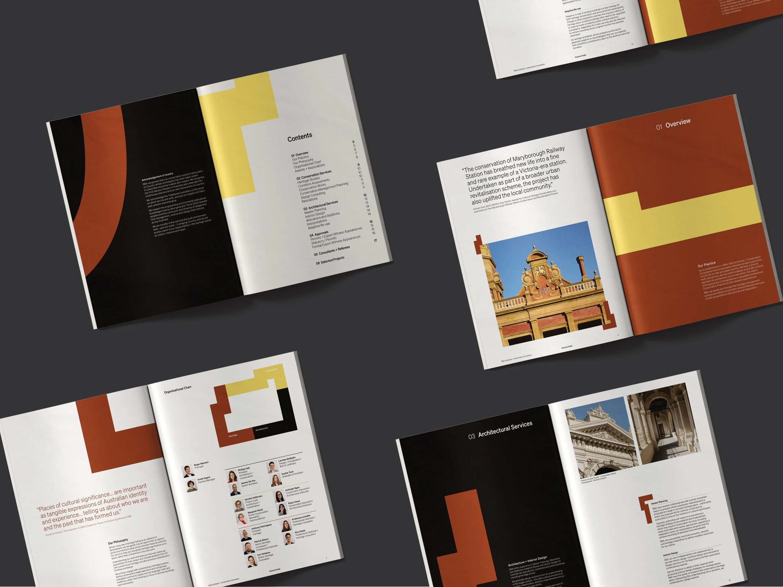
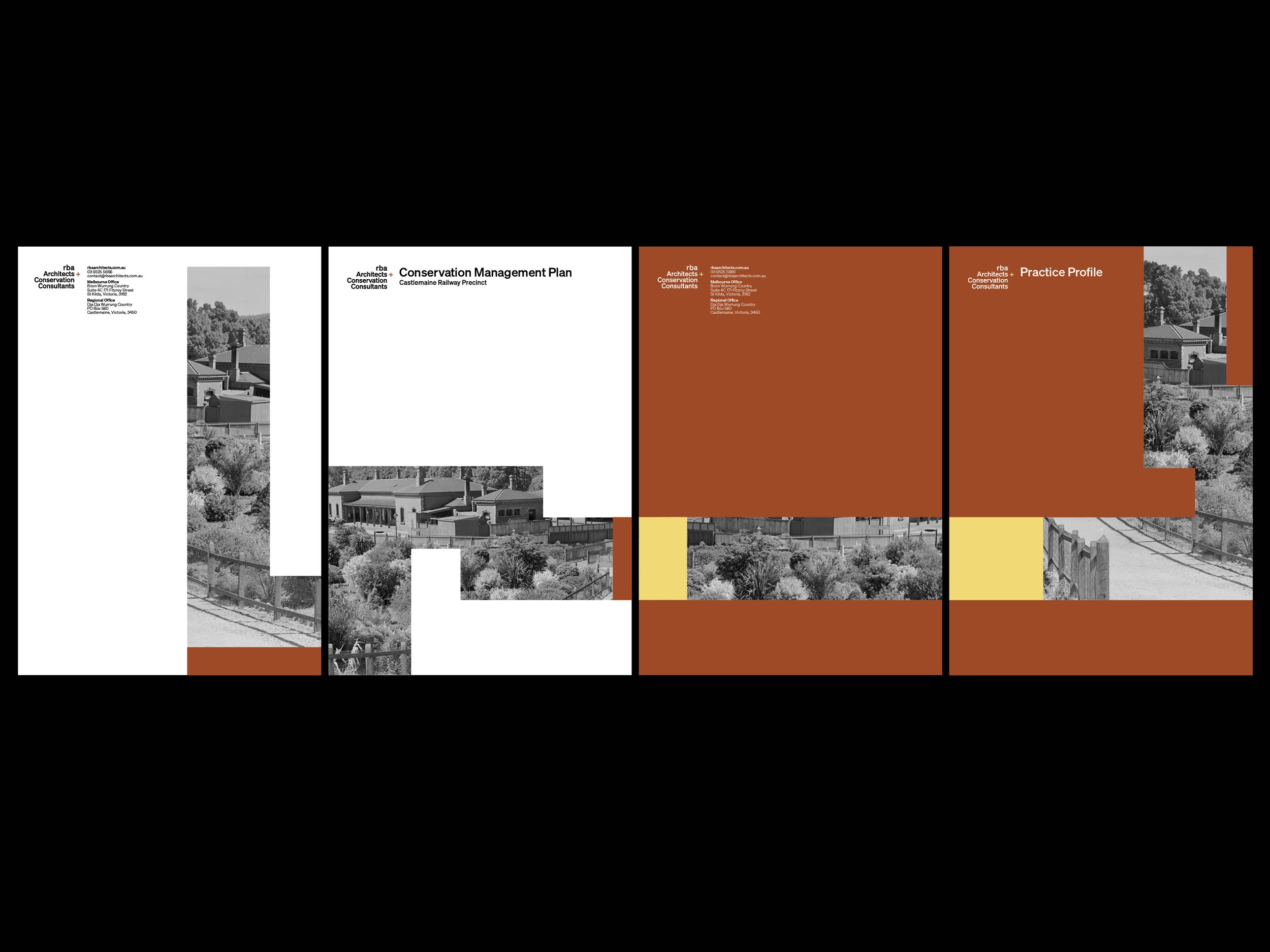
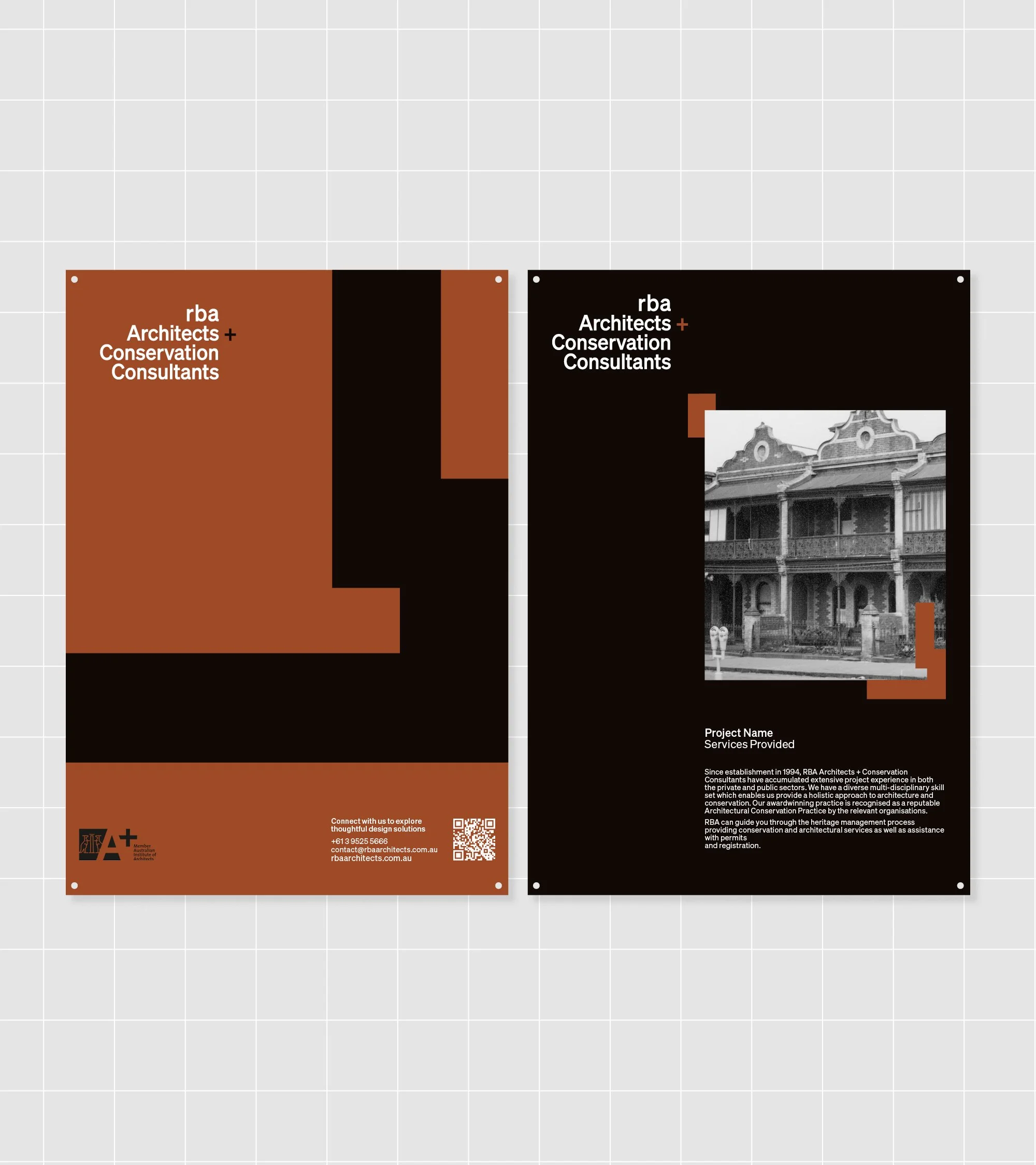
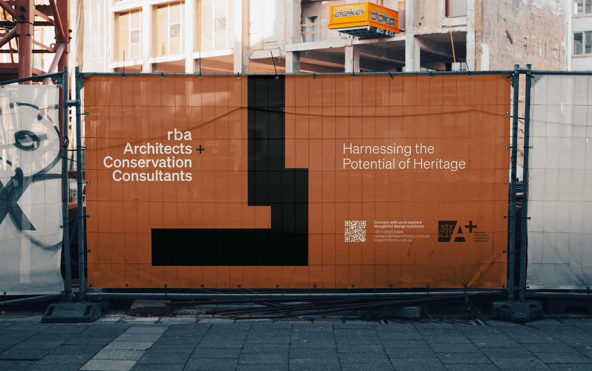
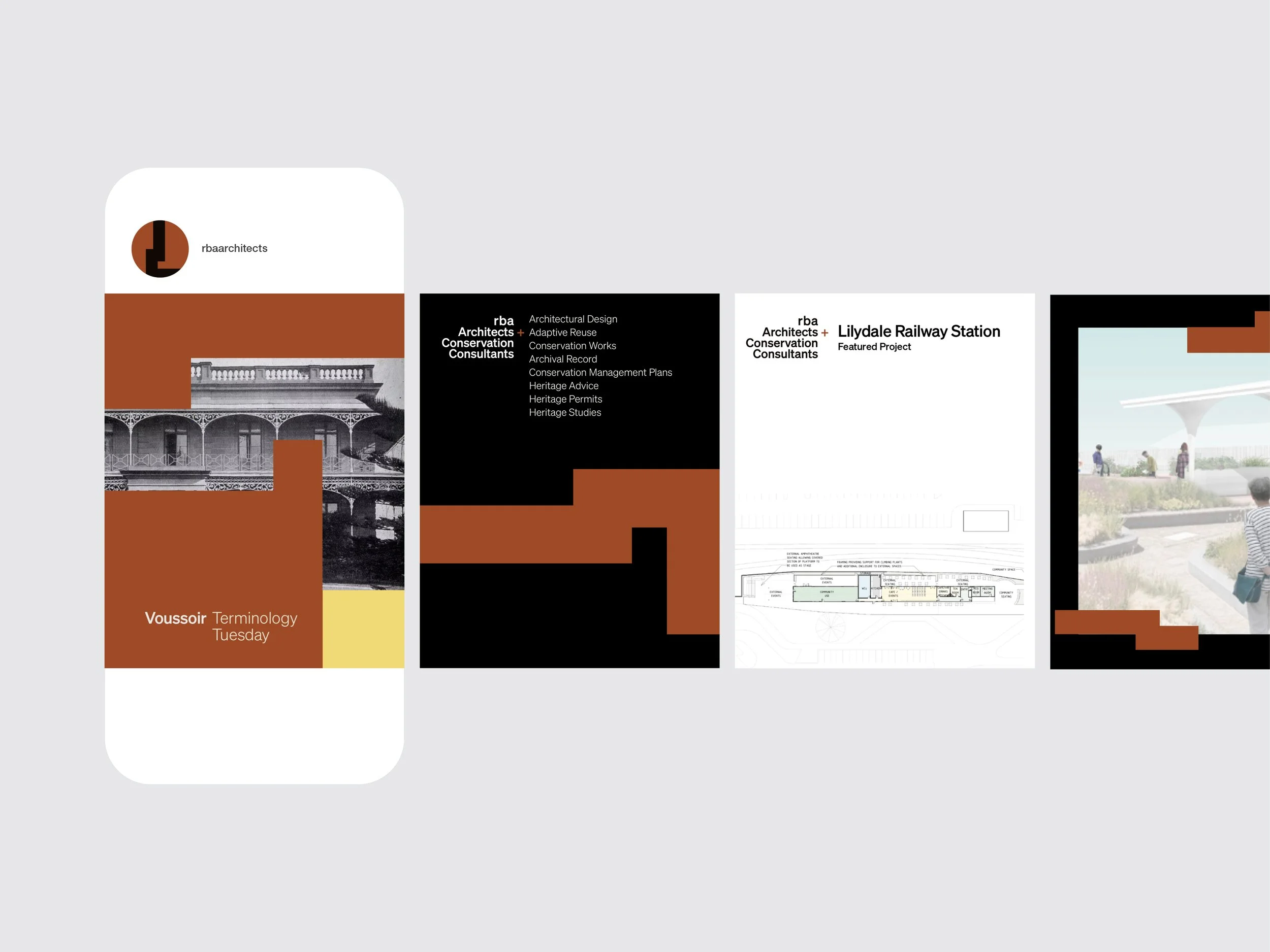
Complementing the logotype, a family of modular graphic elements function as dynamic accents, enhancing recognition across applications and forming a cohesive logo system.
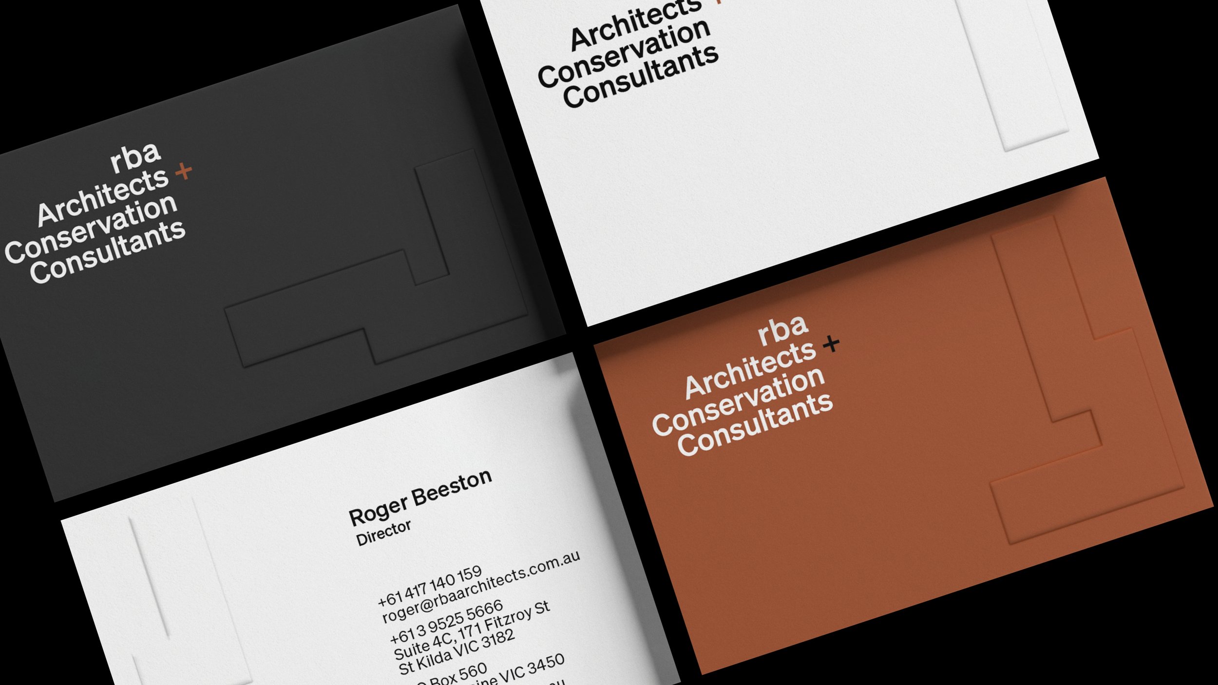
The refreshed RBA identity is both grounded and forward-looking
The logo system is suited to RBA’s varied applications, internal documentation, reports, presentations, signage, digital content and merchandise; modularity and flexibility keeps content fresh, appealing and cohesive.
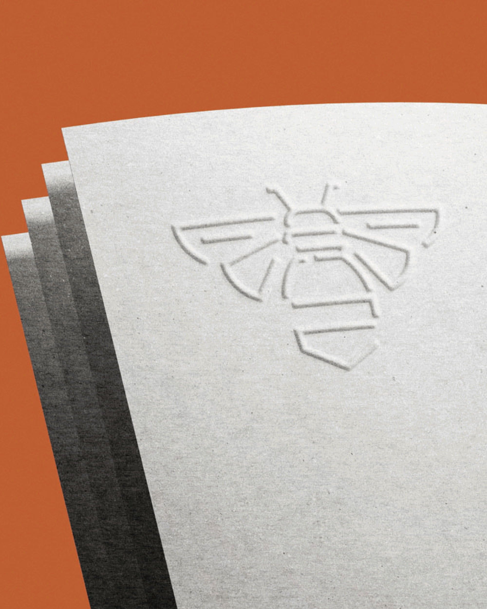
A supplementary icon – the bee – was introduced to deepen the narrative, adding a distinctive layer of meaning; symbolising industriousness, collaboration, and stewardship, it enriches the identity when used thoughtfully and selectively.
RBA’s strengthened visual and verbal identity mirrors the practice – measured in presentation, agile in response, and committed to clarity, insight, and integrity.

RBA Architects + Conservation Consultants Melbourne
Construction & Manufacturing
Visual Brand Identity
Creative Direction
Graphic Design
Digital Design
Signage Design